Background
Earlier this month, I decided to investigate how I could style the menus in my tools to look like tabs, similar to how they are styled in Visual Studio.
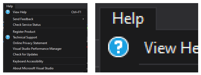
As an example, here is the Help menu in Visual Studio 2019. Notice how there is no edge under the “Help” text.
While I’m sure there are multiple ways of achieving this style, I like the approach described in Menus with Style. However, the post is a guide for how to create this visual style via Blend. I don’t use Blend to edit my styles, so found the guide to be a bit difficult to follow. As such, I figured that it might be a good idea to write up an article that walks through the same design purely in XAML.
Overview
There are two components to the ControlTemplate: the Menu and the Popup.
The Menu component is covered by a single part:
MenuBackground(shown in green)
The Popup is split into two pieces:
SubmenuBorder_Left(shown in blue)SubmenuBorder_Right(shown in red)
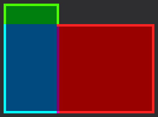
For each part, I’ve highlighted the borders that are required to make up the final style.
Also, you have probably noticed the small strip of purple. This represents an overlap of the blue and red parts, which we will discuss that shortly.
In XAML, we will use the Border element for each of these pieces, since it provides a border edge and background.
One final point before we begin. In this article, I’m using a border edge size of 1 to match the Visual Studio style shown above. However, this approach will work with any edge size.
Menu
There’s nothing too special about the MenuBackground portion so I won’t spend much time here.
From the diagram, we can see that we need border edges along the Left, Top, and Right.
<Border
   x:Name="MenuBackground"
   ...
   BorderThickness="1,1,1,0"
   />
Popup
The key thing to recognize in the diagram above is that the SubmenuBorder_Left must match the width of the MenuBackground. We can do this by binding the Width property to the MenuBackground‘s ActualWidth:
<Border
   x:Name="SubmenuBorder_Left"
   Width="{Binding ElementName=MenuBackground, Path=ActualWidth}"
   ...
   />
With this in place, we can now assemble the Popup background and border. We use a DockPanel to layout the pair of Border elements. The SubmenuBorder_Left is docked on the Left, while the SubmenuBorder_Right fills the rest of the DockPanel area.
Using the diagram above as a guide, the BorderThickness for each part is straightforward:
SubmenuBorder_Left  :   Left,    0,      0,  Bottom
SubmenuBorder_Right :      0,  Top,  Right,  Bottom
Again, I’m using a border edge size of 1 (as you’ll see the in the XAML below).
<DockPanel LastChildFill="True">
   <Border
      x:Name="SubmenuBorder_Left"
      DockPanel.Dock="Left"
      Background="{StaticResource SubmenuBackgroundBrush}"
      BorderBrush="{StaticResource SubmenuBorderBrush}"
      BorderThickness="1,0,0,1"
      Width="{Binding ElementName=MenuBackground, Path=ActualWidth}"
      />
   <Border
      x:Name="SubmenuBorder_Right"
      Margin="-1,0,0,0"
      Background="{StaticResource SubmenuBackgroundBrush}"
      BorderBrush="{StaticResource SubmenuBorderBrush}"
      BorderThickness="0,1,1,1"
   />
</DockPanel>
Overlap
As promised, let’s discuss the overlap.
The overlap is produced by the negative margin of SubmenuBorder_Right: -1, 0, 0, 0
The purpose of this overlap is to produce the corner between the top edge of the popup (in red) and the right edge of the menu item (in green). Without it, there would be a notch in the border edge (as demonstrated below).
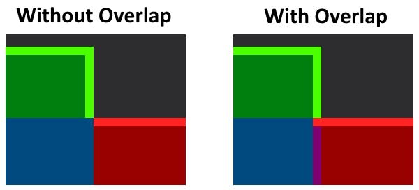
To be clear, the overlap value should match the border edge size (as mentioned earlier, the border edge size is 1).
Final Result
Putting it all together, here are the relevant parts to the ControlTemplate XAML:
<ControlTemplate
   x:Key="{ComponentResourceKey
      ResourceId=TopLevelHeaderTemplateKey,
      TypeInTargetAssembly={x:Type MenuItem}}"
   TargetType="{x:Type MenuItem}"
   >
   <Grid SnapsToDevicePixels="True">

      <!-- Background and Border -->
      <Border
         x:Name="MenuBackground"
         Margin="1"
         Background="{TemplateBinding Background}"
         BorderBrush="Transparent"
         BorderThickness="1,1,1,0"
         />

      <!-- Content -->
      <!-- ... -->


      <!-- Popup -->
      <Popup
         x:Name="PART_Popup"
         AllowsTransparency="True"
         Focusable="False"
         IsOpen="{Binding IsSubmenuOpen, RelativeSource={RelativeSource TemplatedParent}}"
         Placement="Bottom"
         HorizontalOffset="1"
         VerticalOffset="-1"
         >
         <Grid>

            <!-- Submenu Background and Border -->
            <DockPanel LastChildFill="True">
               <Border
                  x:Name="SubmenuBorder_Left"
                  DockPanel.Dock="Left"
                  Background="{StaticResource SubmenuBackgroundBrush}"
                  BorderBrush="{StaticResource SubmenuBorderBrush}"
                  BorderThickness="1,0,0,1"
                  Width="{Binding ElementName=MenuBackground, Path=ActualWidth}"
                  />
               <Border
                  x:Name="SubmenuBorder_Right"
                  Margin="-1,0,0,0"
                  Background="{StaticResource SubmenuBackgroundBrush}"
                  BorderBrush="{StaticResource SubmenuBorderBrush}"
                  BorderThickness="0,1,1,1"
                  />
            </DockPanel>

            <!-- Content -->
            <!-- ... -->

         </Grid>
      </Popup>
   </Grid>

   <ControlTemplate.Triggers>
      <Trigger Property="IsSubmenuOpen" Value="True">
         <Setter TargetName="MenuBackground" Property="Background" Value="{StaticResource SubmenuBackgroundBrush}" />
         <Setter TargetName="MenuBackground" Property="BorderBrush" Value="{StaticResource SubmenuBorderBrush}" />
      </Trigger>
   </ControlTemplate.Triggers>
</ControlTemplate>
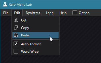
Here is a screenshot of this style used my test application.